Designing debit card management for a fintech platform that had no local precedent.
I led the UX strategy and design of a full debit card management system within Genie — Dialog Axiata’s flagship fintech super app and Sri Lanka’s first PCI-DSS-certified payment platform. This was a zero-to-one feature in a market where no local app had done it before. The challenge wasn’t just visual design — it was defining what card management should even mean for Sri Lankan users, then building something that could scale on a platform already processing billions of rupees in transactions.
01 — Platform context
Before a single wireframe was drawn, I needed the team to understand the weight of the platform we were designing for. Genie wasn’t a startup experiment — it was already the dominant digital payments network in Sri Lanka, and the stakes for getting this right were high.
Rs. 10B+
in transactions processed by early 2021 — the largest volume on the Mastercard Payment Gateway Platform in Sri Lanka
400,000+
downloads at milestone. Any friction we introduced would affect hundreds of thousands of active users immediately
90+
billers supported across utilities, leasing, insurance, and mobile payments — the breadth users expected us to match in card management
PCI-DSS
Sri Lanka’s first certified fintech app, with MBSS compliance and the Personal Data Protection Act No. 9 of 2022 setting our security floor

Best Startup Product — 2019

Best Disruptor Product — 2019

Most Popular Electronic Payment — 2019

Best Mobile App for Retailer Payments — 2019
“
Genie had also just integrated Visa Card-on-File tokenization, making it the first Sri Lankan app to offer one-click-pay with Visa across partner merchants. Our card management feature needed to feel native to — and worthy of — that infrastructure.
02 — The problem
Despite Genie’s scale, Sri Lankan users had no in-app way to manage their debit cards. Freezing a lost card, requesting a replacement, viewing card details, or setting spending limits all required a phone call — often a 30+ minute wait. This friction wasn’t just annoying. In a fraud event, it was dangerous.
Competitive research confirmed the problem ran industry-wide: local bank apps only offered basic block/unblock toggles. FriMi was the outlier, supporting virtual cards and card detail views — but even they hadn’t tackled spending controls, multi-account handling, or linked platform management.
HOW MIGHT WE
Design a leading fintech card management experience in Sri Lanka, ensuring robust security, catering to diverse user preferences, and cementing Genie’s market leadership?
03 — Empathize & Define
We ran primary user research to understand the real pain points — not the assumed ones. Three findings shaped everything that followed.
The 75% figure wasn’t surprising — it was validating. It told us that the problem wasn’t niche. It confirmed we should design card freeze and replacement flows first, and make them fast. The 36% emergency-knowledge stat was more interesting: users didn’t just want to do things, they wanted to understand what was happening to their money. That shaped how we wrote UI copy and structured the suspicious activity alert flow.
Individual consumer
Wants quick freeze/unfreeze and instant fraud alerts. Doesn’t want to call the bank. Primary target for V1.

Frequent traveler
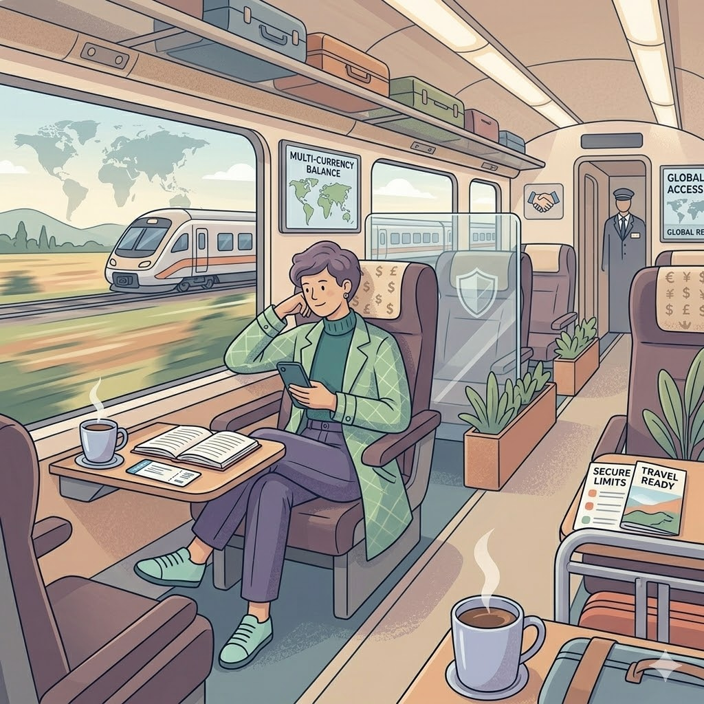
Needs international currency toggles, foreign transaction limits, and linked platform visibility across countries.

Tech-savvy user
Wants granular control — category-level limits, linked platform management, contactless toggle. Expects parity with global apps.
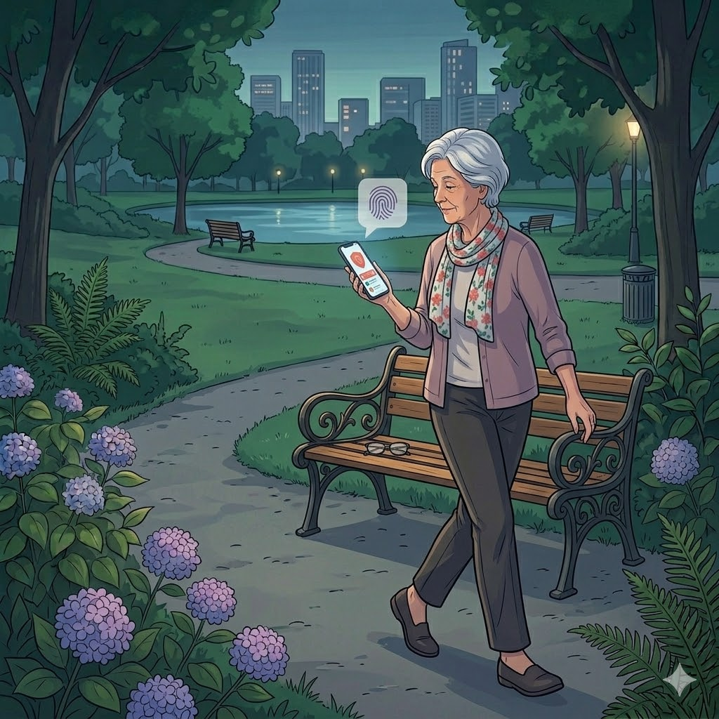
Security-conscious user
Primary concern is fraud visibility and real-time alerts. Needs trust signals, not just features. Also a primary target for V1.
Empathize
Define
Ideate
Prototype
Test
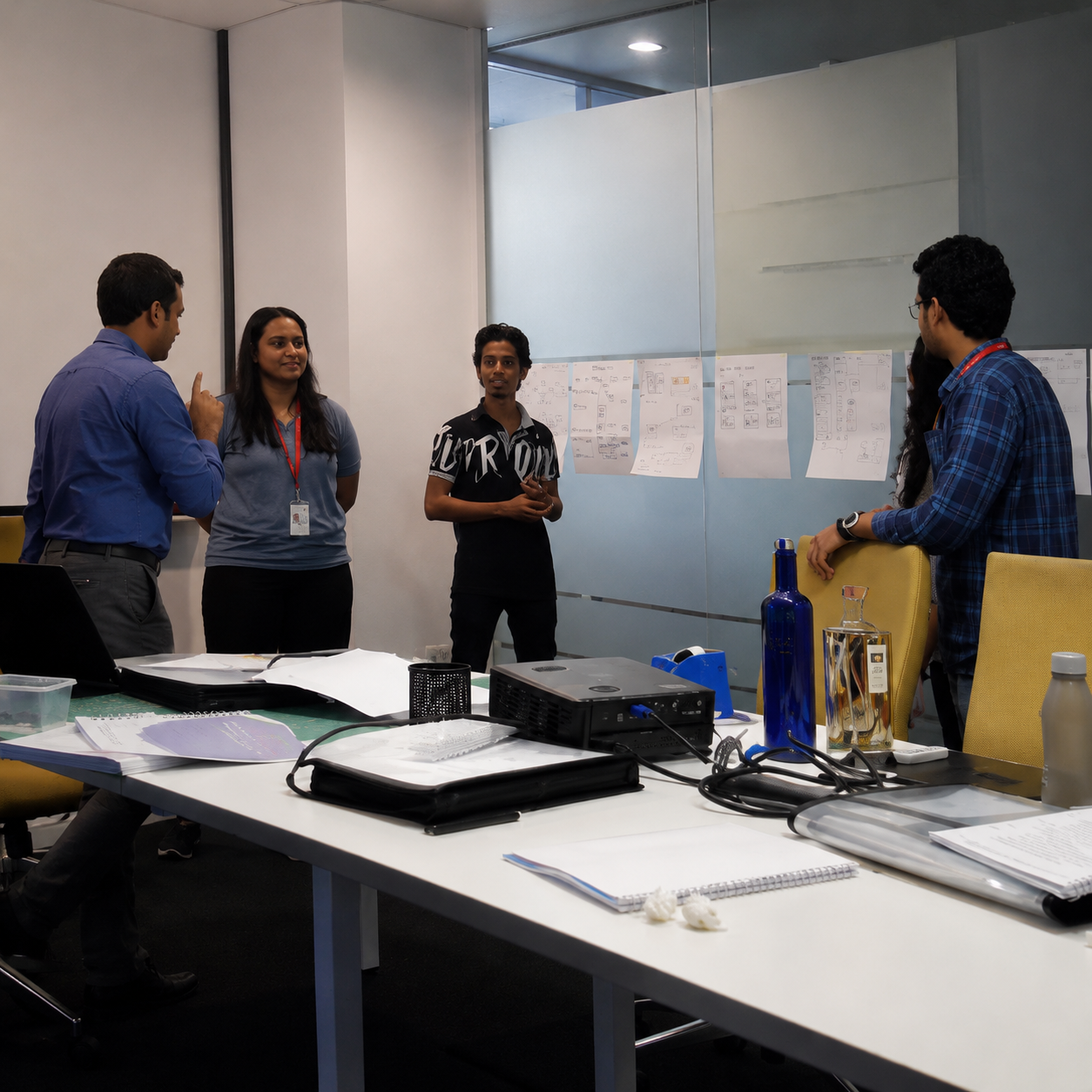
04 — My role as UX Lead
I owned the full design process — not just the screens. That meant framing the research brief, facilitating brainstorming workshops that surfaced the top 10 features to build, managing stakeholder alignment with engineering and compliance, and making the call on what went into V1 versus the backlog.
Every feature was evaluated against two axes: does it reduce a real user pain point, and does it reduce operational cost for the business (support calls, fraud resolution time)? Features that scored on both were prioritised. Features that scored on only one went to a later phase.
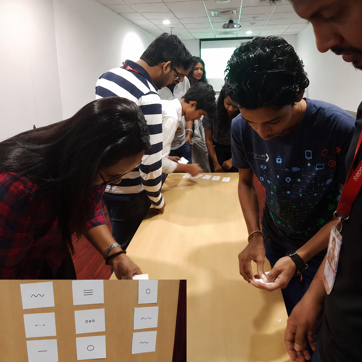
The design stack was Figma for UI and FigJam for collaborative workshops. I ran in-person brainstorming sessions with the team — sticky notes on walls, card sorting, feature prioritisation exercises — to move from insight to concept quickly. The goal was to keep user voices in the room at every stage, even when timelines pushed back.
05 — Design decisions
“ Card management
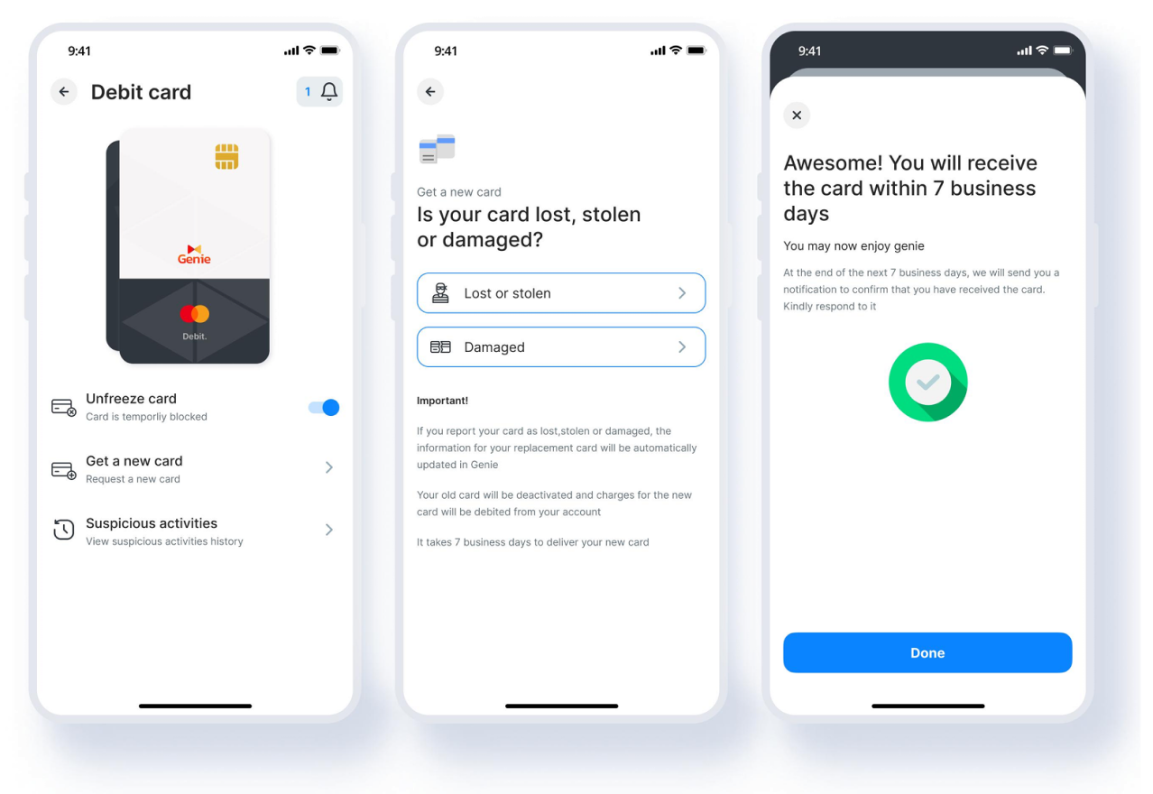
Freeze/unfreeze with a single toggle. Card replacement flow for lost, stolen, or damaged — with a 7-day delivery confirmation and automatic info transfer to the new card.
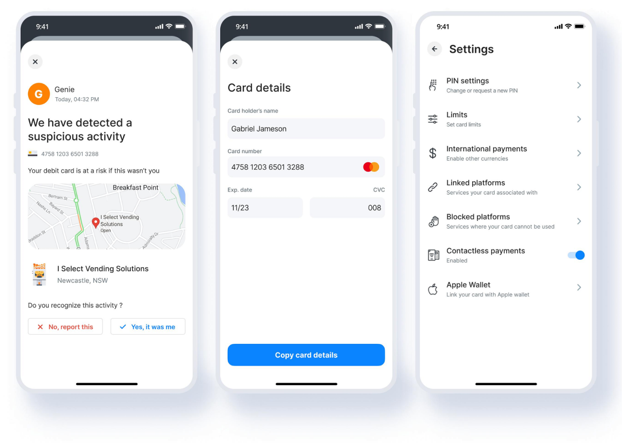
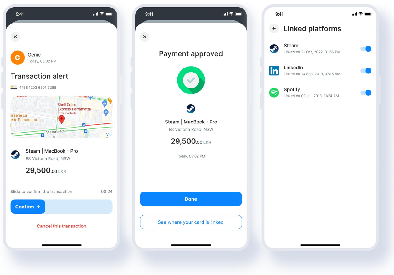
“ Security & fraud alerts
Real-time push notifications with map-based merchant location context. Users flag unrecognized transactions in two taps — no call center needed.
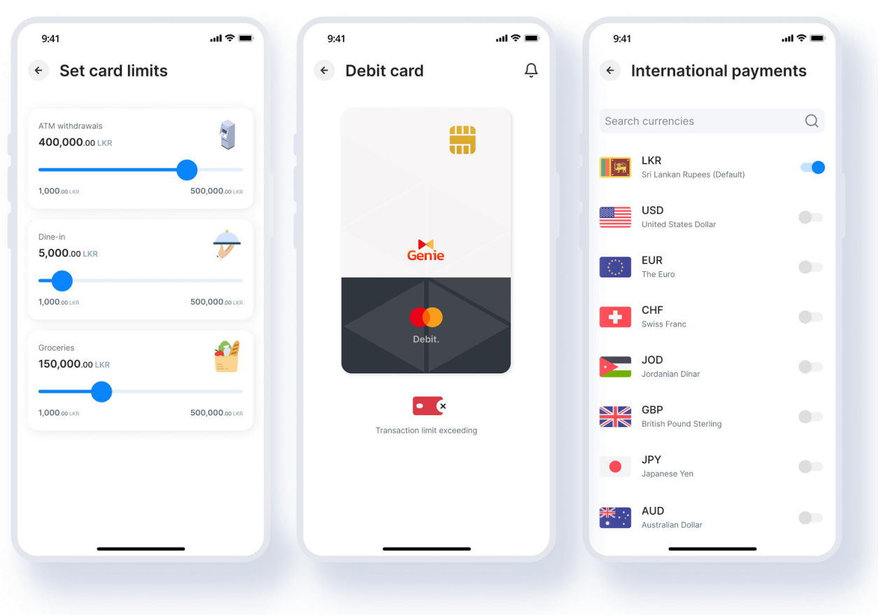
“ Spending limits & payments
Category-level limits (ATM, dining, groceries) with slider controls. Contactless toggle. International currency support across 7+ currencies for the traveler segment.
“ Card-linked platforms
Full visibility into which platforms (Steam, LinkedIn, Spotify) have the card saved. Users can block individual platforms — directly addressing the security-conscious user’s core need.
06 — The hardest design challenge
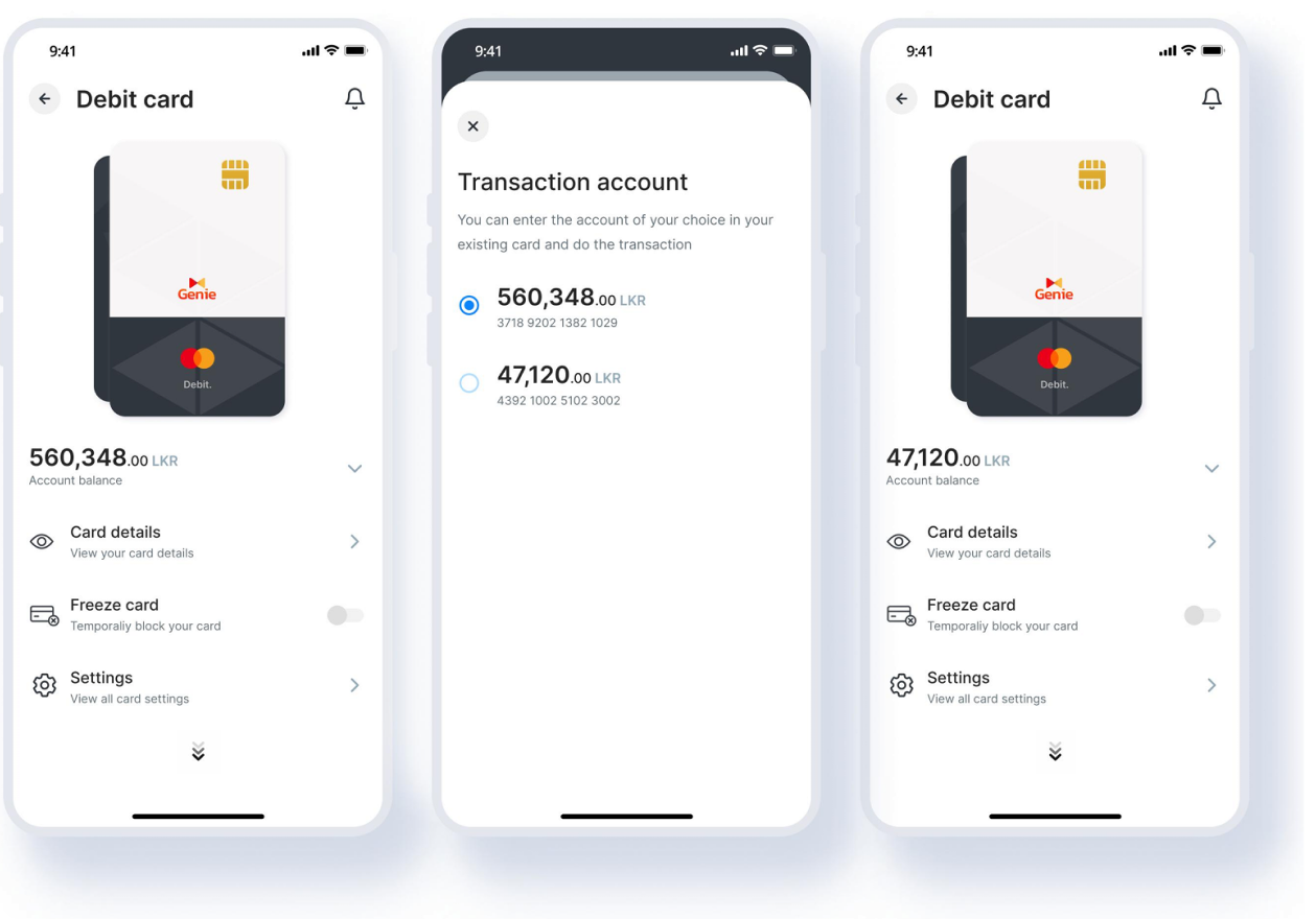
Prototype testing surfaced something we hadn’t fully scoped: users with multiple savings accounts linked to a single debit card. The question was whether to show separate cards per account, or one card with account-switching built in.
“
Separate cards would feel cleaner but created cognitive overhead — users would have to remember which card belonged to which account. One card with a switching overlay kept the mental model simple: one physical card, one place to manage it, with account selection happening at transaction time.
“ The overlay approach
A bottom sheet appears when a user initiates a transaction, letting them choose the source account without leaving the card view. Design principle: one mental model, not one screen per object. The card is the anchor — accounts are attributes of it.
This solution drove a metric the product team hadn’t anticipated this feature would move: a significant uplift in new savings account creation. Because users could finally see and manage multiple accounts without friction, opening another became a natural next step.
07 — Constraints & tradeoffs
PCI-DSS & Central Bank compliance. Every interaction that exposed card data had to be approved against security standards. Card detail screens required specific masking logic, time-limited exposure, and biometric re-authentication. These weren’t design preferences — they were requirements that shaped the interaction model.
User adoption of unfamiliar features. NFC, virtual cards, and tokenization were new concepts for most users. We designed progressive disclosure flows and in-context education — not modal popups — to introduce these features without overwhelming first-time users.
Scale-induced quality bar. With 400,000+ users already on the platform, we couldn’t ship an MVP and iterate quietly. Any bug in a card freeze flow at that scale had real financial and trust consequences. Testing coverage was non-negotiable.
Mandatory update UX. Genie’s forced-update model created a real user pain point: users couldn’t complete urgent card actions if an update was pending. We advocated for graceful degradation handling in high-urgency flows.
08 — Impact
Significant
reduction in card-related support calls — users now self-serve what previously required a phone call
Notable
uplift in new savings account creation — an unplanned outcome of the multi-account design decision
High
user satisfaction with card features — security-conscious users specifically cited fraud alerts as a trust builder
The design system and interaction patterns built for this feature were later adopted across other Genie modules, extending the ROI of this project beyond its original scope. The card management work also fed into Genie’s evolution toward becoming a full financial super app — adding savings, fixed deposits, loans, and investment products on the same design foundation.
09 — Future opportunities

Virtual card infrastructure
Genie’s tokenization backend supports secure virtual cards for online-only spending, minimizing exposure of physical card details.

AI-powered spend insights
Genie Assistance can use card transaction data to deliver proactive spending insights and smarter financial behaviour coaching.

Business card parity
The consumer card management patterns can be extended into Genie Business to support smarter MSME-focused business card controls.

Traveler mode
A one-tap Travel Mode could instantly enable international payments, adjust ATM limits, and surface foreign currency support for travelers.
10 — Reflections
Users earlier, always. The multi-account edge case only surfaced in prototype testing. Bringing users into ideation — not just validation — would have found it in week two, not week eight.
Compliance as a design partner. Treating PCI-DSS requirements as constraints to work around wasted time. Treating the compliance team as a co-designer — who shared the goal of user trust — unlocked better solutions faster.
Metrics you don’t expect. The savings account uplift wasn’t in our success criteria. Now I always ask: what behaviour might this design accidentally change? That question has improved every project since.
If I ran this project again, I’d build a lightweight post-launch feedback loop into the feature itself — a passive signal that tells the design team whether users are finding what they need without a support ticket. At Genie’s scale, even a 1% improvement in task completion is tens of thousands of better experiences.